

Stem And Leaf Plot
Introduction
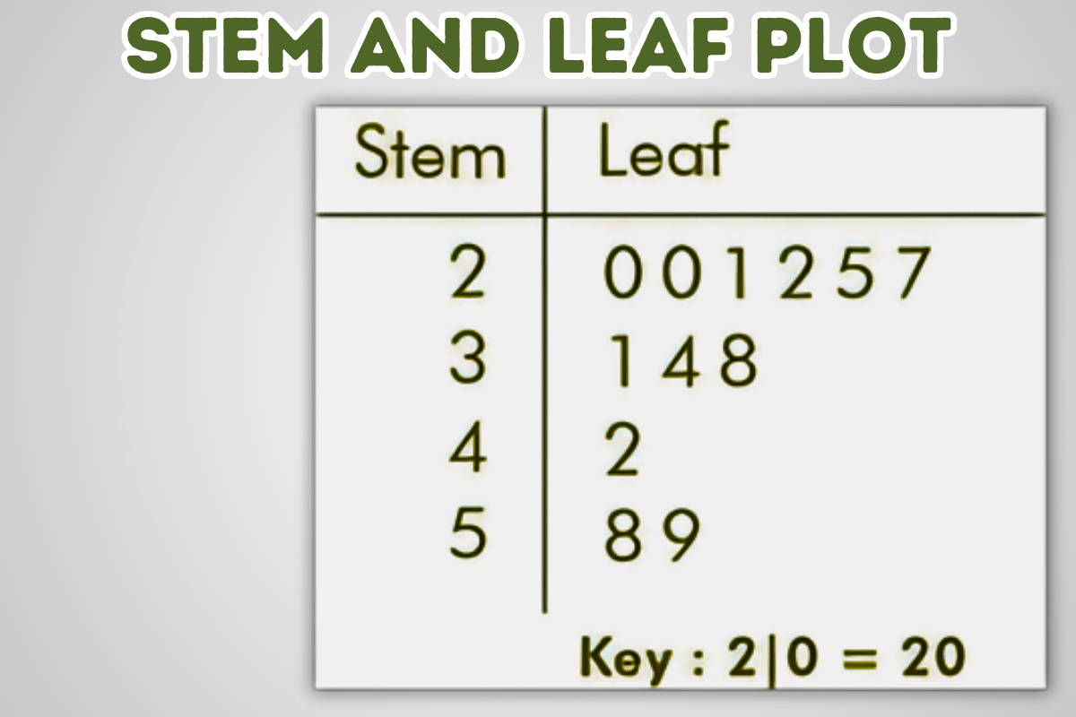
A Stem And Leaf Plot is a graphical representation of a set of data that helps visualize its distribution. It is a simple and effective way to display data and can be used to identify patterns, outliers, and other data features.
To create a Stem And Leaf Plot, divide the data into stems and leaves. The stem is the leftmost digit of the data value, and the leaf is the remaining digit. For example, in the data value 123, the stem is one, and the leaf is 23. You then arrange the stems in ascending order and write the leaves beside their corresponding stems.
Stem-and-leaf plots are valuable tools for data analysis. They can identify patterns, outliers, and other features of the data that may not be obvious from the data itself. Stem-and-leaf plots are also easy to create and interpret, making them a good choice for exploratory data analysis.
Leaf Plots
Creating a Stem-and-Leaf Plot
A Stem And Leaf Plot is a graphical representation of a set of data that helps visualize its distribution. It is a simple and effective way to display data and can be used to identify patterns, outliers, and other features of the data.
To create a Stem And Leaf Plot, follow these steps:
- Divide the data into stems and leaves: The stem is the leftmost digit or digits of the data value, and the leaf is the remaining digit or digits. For example, in the data value 123, the stem is one, and the leaf is 23.
- Arrange the stems in ascending order: List the stems in order from smallest to largest.
- Write the leaves beside their corresponding stems: For each stem, write the leaves in ascending order to the right of the stem.
- Example
Consider the following data set:
12, 15, 18, 21, 23, 26, 29, 32, 35, 38
To create a Stem And Leaf Plot for this data set, we would first divide the data into stems and leaves:
- 2, 5
- 1, 3, 6, 9
- 2, 5, 8
Next, we would arrange the stems in ascending order:
StemLeaf
- 2, 5
- 1, 3, 6, 9
- 2, 5, 8
Finally, we would write the leaves beside their corresponding stems:
- 1 | 2 5 2 | 1 3 6 9 3 | 2 5 8
The resulting Stem And Leaf Plot is shown below:
- Stem Leaf —– —– 1 2 5 2 1 3 6 9 3 2 5 8
Tips
- If the data values have different numbers of digits, you can add leading zeros to the shorter values to make them all the same length.
- You can also use a decimal point to separate the stem from the leaf.
- If the data values are negative, you can use a negative sign to indicate the negative values.
Stem-and-leaf plots are a simple and effective way to visualize data. They can identify patterns, outliers, and other data features. Stem-and-leaf plots are a valuable tool for data analysis and can be used in various applications.
Interpreting a Stem-and-Leaf Plot
A Stem And Leaf Plot is a graphical representation of a set of data that helps visualize its distribution. It is a simple and effective way to display data and can be used to identify patterns, outliers, and other features of the data.
To interpret a Stem And Leaf Plot, follow these steps:
- Identify the stems and leaves: The stems are the leftmost digits of the data value, and the leaves are the remaining digits. For example, in the data value 123, the stem is one, and the leaf is 23.
- Examine the data distribution: The Stem And Leaf Plot will show you how the data is distributed. For example, if the data is roughly symmetric, the Stem And Leaf Plot will be roughly symmetric. If the data is skewed, the Stem And Leaf Plot will be skewed.
- Identify patterns: The Stem And Leaf Plot may reveal patterns in the data. For example, you may see gaps in the data, indicating no data values in a particular range. You may also see clusters of data values, which characterize many data values in a specific range.
- Identify outliers: Outliers are data values significantly different from the rest. Outliers may be indicated by gaps in the Stem And Leaf Plot or data values far from the other data values.
Example
Consider the following Stem And Leaf Plot:
Stem | Leaf —–|—– 1 | 2 5 2 | 1 3 6 9 3 | 2 5 8
This Stem And Leaf Plot shows the data is roughly symmetric with a peak at 2. The plot also shows that there are no outliers in the data set.
Stem-and-leaf plots are a simple and effective way to visualize data. They can identify patterns, outliers, and other data features. Stem-and-leaf plots are a valuable tool for data analysis and can be used in various applications.
Visualizing Data
Visualizing data is representing data in a graphical or pictorial format. This can help to make the data easier to understand and identify patterns and trends. There are many different ways to visualize data, including:
Charts
Charts are a common way to visualize data. They can be used to show the relationship between two or more variables. Some of the most common types of charts include:
- Bar charts: Bar charts are used to compare the values of different categories.
- Line charts: Line charts show how a variable changes over time.
- Pie charts: Pie charts are used to show the proportions of a whole.
Graphs
Graphs are another way to visualize data. They can be used to show the relationship between two or more variables. Some of the most common types of graphs include:
- Scatterplots: Scatterplots are used to show the relationship between two variables.
- Histograms: Histograms are used to show the distribution of a variable.
Box plots show a variable’s median, quartiles, and outliers.
Maps
Maps visualize geographically distributed data. They can show the distribution of a variable across a region or the world.
Other Visualizations
In addition to charts, graphs, and maps, there are many other ways to visualize data. Some of these include:
- Tables: Tables are a simple way to organize and display data.
- Infographics: Infographics combine text, images, and charts to present information visually appealingly.
- Interactive visualizations: Interactive visualizations allow users to explore data and identify patterns independently.
Benefits of Visualizing Data
There are many benefits to visualizing data, including:
- Easier to understand: Visualizations can make data more accessible and easily understood by presenting it more intuitively.
- Identify patterns and trends: Visualizations can help to identify patterns and trends in the data that may not be obvious from the data itself.
- Make informed decisions: Visualizations can help make informed decisions by clearly understanding the data.
Visualizing data is a powerful way to make data more understandable and valuable. There are many different ways to visualize data, so it is essential to choose the most appropriate method for the data and the intended audience.
Conclusion
Stem-and-leaf plots are a simple and effective way to visualize data. They can identify patterns, outliers, and other data features. Stem-and-leaf plots are a valuable tool for data analysis and can be used in various applications.
- Here are some of the benefits of using Stem And Leaf Plots:
- Stem-and-leaf plots are easy to create and interpret.
- Stem-and-leaf plots can be used to visualize a wide variety of data sets.
- Stem-and-leaf plots can help identify patterns, outliers, and other data features.
- Stem-and-leaf plots can be used to compare different data sets.
- Overall, Stem And Leaf Plots are versatile and powerful tools for data visualization and analysis. They can help users gain insights into the data and make informed decisions.
Must Read Articles:
Clark County Education Association: Advocating for Educators and Students
Reading Goals for Students: A Comprehensive Guide for Educators
The Ancient Germanic Alphabet: The Runes
The Upside-Down Question Mark ¿
STEM: Science, Technology, Engineering, and Mathematics
NSW Department of Planning and Environment: Shaping the Future of New South Wales
FAQ
- What is a Stem And Leaf Plot?
A Stem And Leaf Plot is a graphical representation of a set of data that helps visualize its distribution. It is a simple and effective way to display data and can be used to identify patterns, outliers, and other features of the data.
- How do I create a Stem And Leaf Plot?
To create a Stem And Leaf Plot, follow these steps:
- Divide the data into stems and leaves: The stem is the leftmost digit or digits of the data value, and the leaf is the remaining digit or digits.
- Arrange the stems in ascending order: List the stems in order from smallest to largest.
- Write the leaves beside their corresponding stems: For each stem, write the leaves in ascending order to the right of the stem.
- How do I interpret a Stem And Leaf Plot?
To interpret a Stem And Leaf Plot, follow these steps:
- Identify the stems and leaves: The stems are the leftmost digits of the data value, and the leaves are the remaining digits.
- Examine the data distribution: The Stem And Leaf Plot will show you how the data is distributed. For example, if the data is roughly symmetric, the Stem And Leaf Plot will be roughly symmetric. If the data is skewed, the Stem And Leaf Plot will be skewed.
- Identify patterns: The Stem And Leaf Plot may reveal patterns in the data. For example, you may see gaps in the data, indicating no data values in a particular range. You may also see clusters of data values, which characterize many data values in a specific range.
- Identify outliers: Outliers are data values significantly different from the rest. Outliers may be indicated by gaps in the Stem And Leaf Plot or data values far from the other data values.
- What are the benefits of using Stem And Leaf Plots?
Stem-and-leaf plots are a simple and effective way to visualize data. They can identify patterns, outliers, and other data features. Stem-and-leaf plots are a valuable tool for data analysis and can be used in various applications.
- What are the limitations of Stem And Leaf Plots?
Stem-and-leaf plots can be difficult to create and interpret for large data sets and to compare between different data sets.
Overall, Stem And Leaf Plots are versatile and powerful tools for data visualization and analysis. They can help users gain insights into the data and make informed decisions.